


I let my dad down. Trevor was an architect, and earlier this week one of his modernist designs, the Fawcett House (1966), was torn down to make room for something new and improved. Thomas Allen wrote an eloquent and heartfelt lament about it in The Inlet, saying, “the tranquil courtyard, barrel-vaulted roof with celestial windows, […]
CEOs push to publish
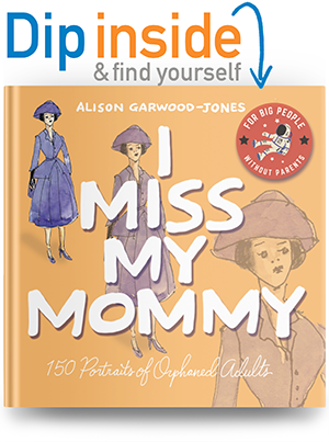
Originally published in March 2017 in Blog
I originally wrote this piece for Parcel Design’s Insights Blog. All artwork by Gary Beelik. When Bill Taylor co-founded Fast Company magazine in 1995, he used its glossy pages to imagine a better business world. But when Taylor, a leader in publishing and strategic change, announced that “it’s great to be an alumnus of print” in an interview […]
We the people
Originally published in February 2017 in Blog
Flesh tones
Originally published in November 2016 in Blog
The only thing I remember about colour mixing from grade school is: red + blue = purple. I’m guessing you also discovered that the result was an ugly, muddy maroon, not the Tyrian purple worn by Roman emperors. For that, according to Aristotle, I’d have to source some crushed shellfish. I only had a Prang […]
We work for society
Originally published in October 2016 in Blog
“We work for society.” This is how my dad, Trevor Garwood-Jones (1928-2011), described an architect’s responsibilities to the communities they build in. Buildings house our existing emotions, but also create new ones — some drab, some inspired depending on the quality of the design. Beauty was key, in Trevor’s mind, to building empathy and a sense […]
Colour variations
Originally published in September 2016 in Blog
Accessible Design in Canada
Originally published in August 2016 in Blog
FIFTY YEARS AGO, graphic design meant two things: working in print and kicking out mind-blowing creative. Wait, make that three: insisting on your own vision. The brash antics of Madison Avenue’s “Big Idea” branding campaigns, personified by George Lois and his “my way or the highway” client dynamic, have long since been replaced by a […]
In Conversation with Anita Kunz
Originally published in May 2016 in Blog
hen Anita Kunz was a five-year old growing up in Kitchener, Ontario in the early 1960s, she practiced drawing the usual kid stuff: horses, flowers, fluffy clouds. But making Crayola masterpieces for the fridge wasn’t enough. Anita drew with a stronger sense of purpose learned from her uncle, the artist and environmentalist Robert Kunz. His editorial illustrations […]