


Manly Man
April 12, 2017
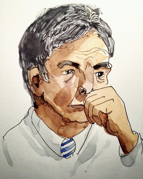
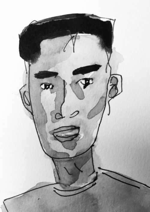
I called this one, Manly Man. As soon as I put my brush down, I heard the expression: “I’m not a doctor. I just play one on TV.”
My friend Nichola asked how I made this drawing. It came about thusly: I went to a cafe (Tampered Press) with my cheap watercolour notebook and a Uniball Gel Pen (black, waterproof), looked around for subjects, saw this guy mid-think and quickly laid down the form. I don’t carry a pencil because working in ink forces me to look and commit. A few days later, in a colouring mood, I mixed some yellow ochre and quinacridone rose and dropped in some puddles of flesh tone. Finally, I mixed red, blue and yellow to get his black hair and greyed it up with a white gel pen. The key to getting his expression was to resist looking at my page when I was drawing him. No judgement. No editing. Just doing.
Internet nostalgia
March 29, 2017
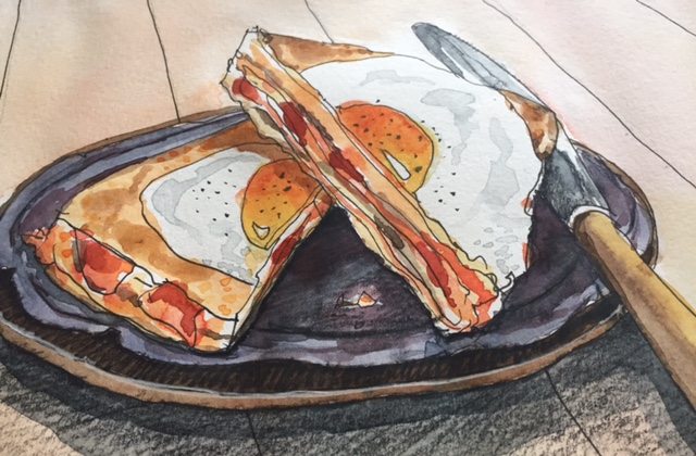
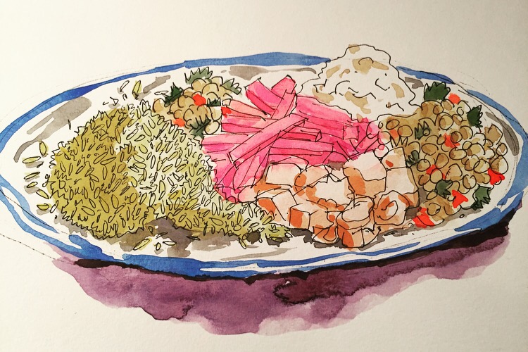
Let’s go back to the quaint practice of posting your lunch online.
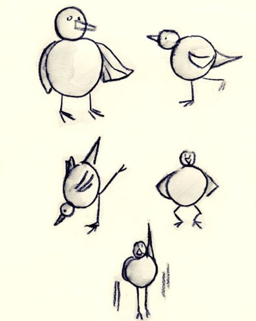
Sunday sketchbook
March 12, 2017
Challenging yourself to do more with less is the best recipe for growth. #ThreePrimaries #IllustrateThe6ix
Lake Ontario
March 5, 2017
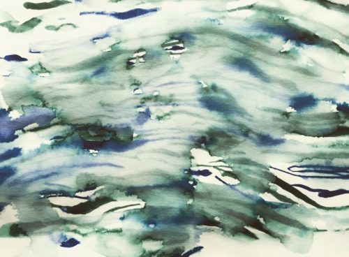
Lake Huron rolls, Superior sings
In the rooms of her ice-water mansion
Old Michigan steams like a young man’s dreams
The islands and bays are for sportsmen
And farther below Lake Ontario
Takes in what Lake Erie can send her
And the iron boats go as the mariners all know
With the gales of November remembered …
Gordon Lightfoot
Illustration by Alison Garwood-Jones,
using water-soluble Tombow markers.
CEOs push to publish
March 2, 2017
I originally wrote this piece for Parcel Design’s Insights Blog. All artwork by Gary Beelik.
When Bill Taylor co-founded Fast Company magazine in 1995, he used its glossy pages to imagine a better business world. But when Taylor, a leader in publishing and strategic change, announced that “it’s great to be an alumnus of print” in an interview with digital marketer Mitch Joel, you’d think our need for anything on paper was categorically over.
Well, it’s not. In a knowledge-based economy, business owners and brands need to be published to be considered the experts in their field, and this realization — a long time coming, but only recently pounced upon — has contributed to the increased demand from CEOs and brands for presentation materials and thought-leadership marketing tools in print (as value-added gifts) and digital formats, including e-books, white papers, videos, as well as Keynote and PowerPoint presentations.
Part of this recasting of business leaders and brands as teachers, mentors and educators who are there to support and meet their customer’s needs goes hand-in-hand with the rise of training and problem-solving websites (like Lynda.com, Skillshare.com and MasterClass.com) that cater to the workplace and economy’s call for adaptation and lifelong learning.
But these are not your parents’ white papers. The current batch of educational marketing tools taps into the lively storytelling and sophisticated design packaging solutions of consumer publications. But that’s to be expected when the materials are being art directed by ex-book and magazine creative directors and ghostwritten by journalists — Taylor’s growing alumni from print media.
Self-publishing never looked this good
Gary Beelik is one such alumnus. A former book cover designer for Penguin and now Parcel’s creative director, he believes that the design of thought-leadership materials directly contributes to establishing a brand’s credibility and consumption. “If you are not empowering your client with [well-designed tools that encourage their growth through education], they are going to get left behind.”
One factor affecting the design of these thought-leadership tools is the Q&A format of Google searches. Thought leaders know they can best serve their customers by solving the problems those customers admit to in the search engine. “How to pitch?” — a common question — is a case in point. To tackle this million-dollar question, Parcel teamed up with Hamish McKenzie, co-founder of McKenzie Pitch Partners, to create Pitch, a how-to book on the art of crafting the perfect sales pitch. Design was central to defining McKenzie’s process. “One of the things we wanted to do,” says Beelik, “was to organize the information in a sequential and very simple way.”
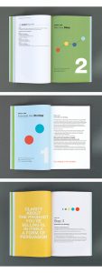
Beelik used the dot in the company logo as a starting point and turned it into a wayfinding device. “Through application of those little dots, the reader is given clues as to where they are in the process because the colour of the dots changes with each step.” Beelik adds, “The dot icon as a graphic element stemmed from Hamish’s idea that you’re looking at the outcome of something, so you always start at the end and then work back.” It’s the old axiom: identify the opportunities and be clear about the results you are going for. This well-designed book became a game-changer for him by further increasing his lineup of speaking engagements and workshops.
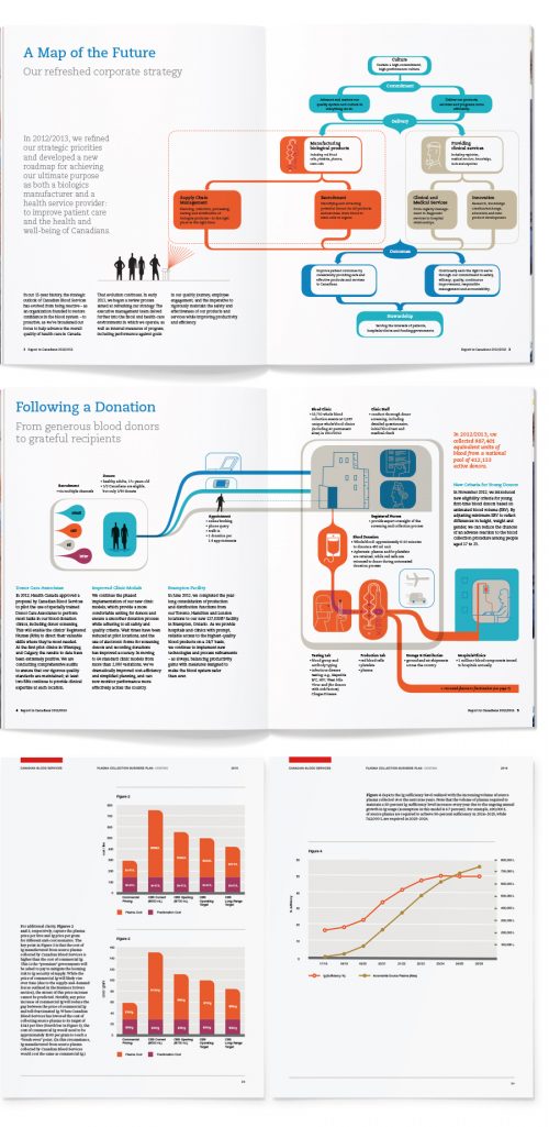
In another example of how a solutions-based approach to marketing materials resulted in a simplified graphic design, Beelik points to his use of infographics in a white paper designed for Canadian Blood Services. The report outlines CBS’s goals for the next five to 10 years. “One of the reasons that we are even able to do this work is because, in the past, people weren’t able to get through the content. It was too dry.” Tapping into the design language of the internet — infographics, pictographs and badges — helped increase engagement, says Beelik. “Design is about trends and always has been. Those are what people are interested in seeing, and it’s how we view the world right now. Topical motifs can spark their imagination in whatever message you are trying to get across.”
As the internet becomes more video-centric, Beelik also points to the increased use of embedded motion graphics in presentation materials uploaded to PowerPoint or Keynote. For a decade, Parcel has been working on the annual general meeting materials for First Capital Realty inc, a retail shopping centre developer and management company. “Their presentation materials are designed to attract investors, stakeholders and bankers,” explains Beelik, “and this year we raised the level of graphics to support the idea of stability through massive growth. Video animation was a far more effective tool than stills in telling their before and after story.”
Every brand is a living thing. “It can’t be stagnant,” insists Beelik. “We’re always kicking the tires and pushing at boundaries with design to help clients understand where they are going.”