


“We work for society.” This is how my dad, Trevor Garwood-Jones (1928-2011), described an architect’s responsibilities to the communities they build in. Buildings house our existing emotions, but also create new ones — some drab, some inspired depending on the quality of the design.
Beauty was key, in Trevor’s mind, to building empathy and a sense of connectedness between human beings. He wasn’t one bit shy about admitting that he wept each time he stood inside an empty French Gothic cathedral. Beethoven had the same effect on his tear ducts. That’s one of the reasons why he specialized in acoustics.
During his career, Trevor found a resistance in the men he dealt with — builders, engineers, government officials, clients — to most aspects of beauty beyond the female form. Many outright refused to discuss colour with him, saying they would bring in the wives to deal with that. “They’re not at home in an artistic environment,” dad said. “It’s like they’re saying, ‘Colour is beneath us, or effeminate or we don’t want to deal with it.’ There’s a nervousness there, which means you can’t show them the direction you’re trying to go in. Devaluing the arts [like this],” he said, ” affects all society.”
This interview was shot in 1991 and stored on a DVD. I screened it on an ancient laptop that I’m glad I didn’t throw out.. I don’t know who organized and shot this video, but if someone does know, please email me so I can credit their work and thank them.
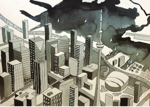

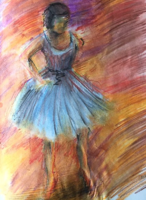
 Photo Credit: