So says Eileen Myles on Design Matters podcast with Debbie Millman. #Auden #Cohen #Whitman #Kunitz #Neruda #Collins
#Dickinson #poetry


December 4, 2016
So says Eileen Myles on Design Matters podcast with Debbie Millman. #Auden #Cohen #Whitman #Kunitz #Neruda #Collins
#Dickinson #poetry
November 21, 2016
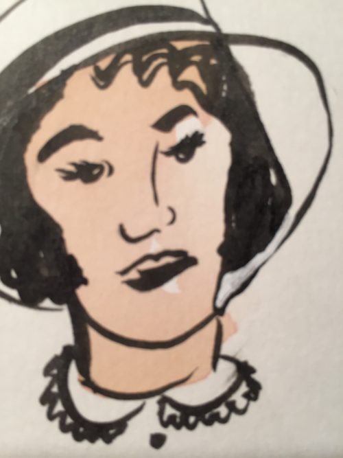
In her next role, Jessica played a 1930s stenographer.
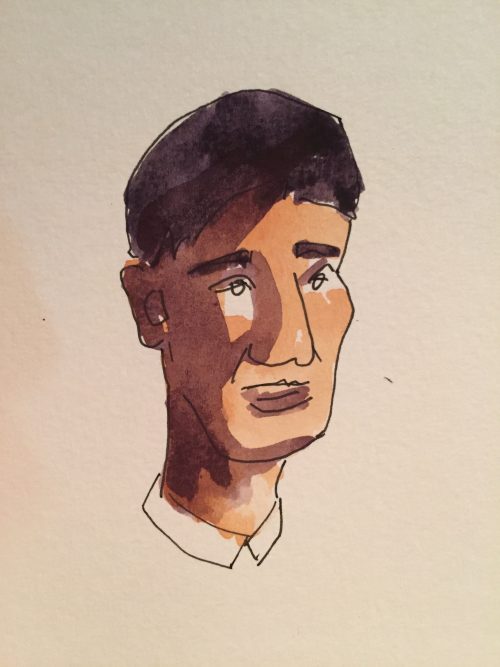
Bruce wondered if he would find another job.
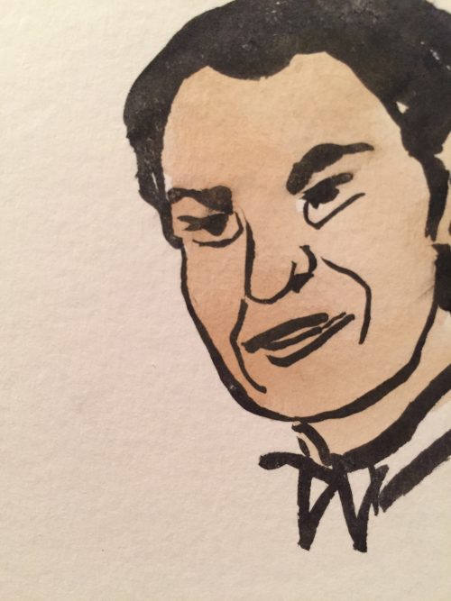
Pedro’s days in the band took him all over Mexico.
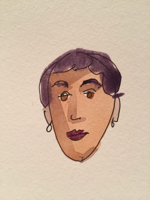
Barbara swims every day. She doesn’t talk to the other swimmers.
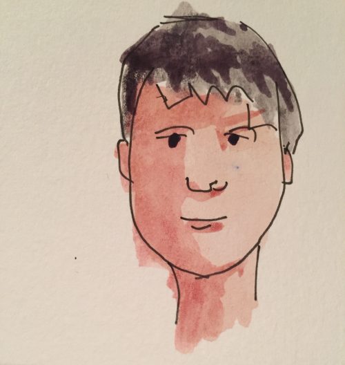
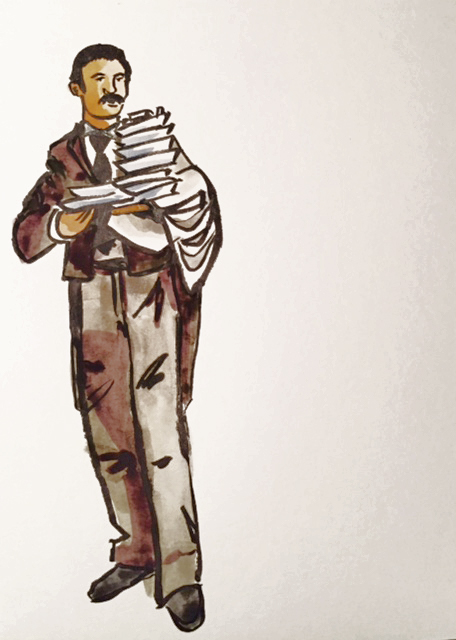
Stephen wrote Carrie in a trailer on a portable typewriter.
November 20, 2016
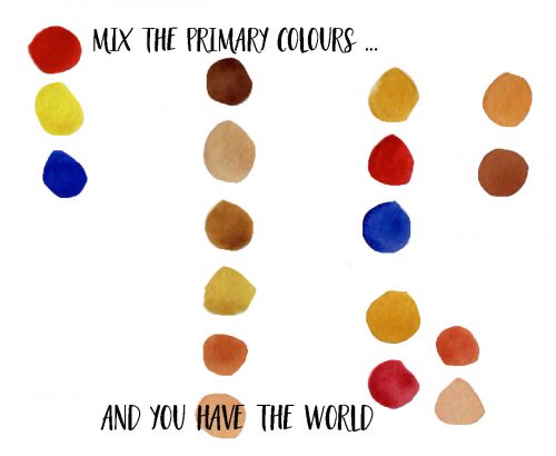
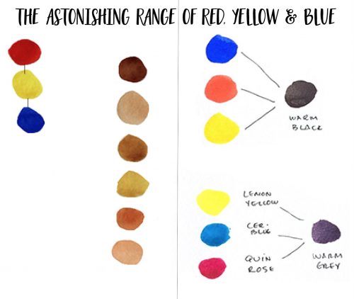
The only thing I remember about colour mixing from grade school is: red + blue = purple.
I’m guessing you also discovered that the result was an ugly, muddy maroon, not the Tyrian purple worn by Roman emperors. For that, according to Aristotle, I’d have to source some crushed shellfish. I only had a Prang 12-colour paint set. But it came with a pre-mixed violet, so I used that.
Coming in a close second was: blue + yellow = green.
From that I got a pukey bog green, not the mesmerising emerald green I insisted on seeing. Nor was it the radioactive sap green I thrill to every time I order the seaweed salad at my favourite sushi joint. These experiments were deflating.
I spent the rest of grade school and high school avoiding colour mixing and using hues straight from the pan or tube — everything from bright magentas and peacock blues to flesh tones and black. I also mixed in a lot of white which, of course, obliterates the special veiled magic of watercolour painting.
I’d say my early work showed promise, but with no concept of colour mixing or glazing, and an over-dependence on white, my paintings were flat and lifeless.
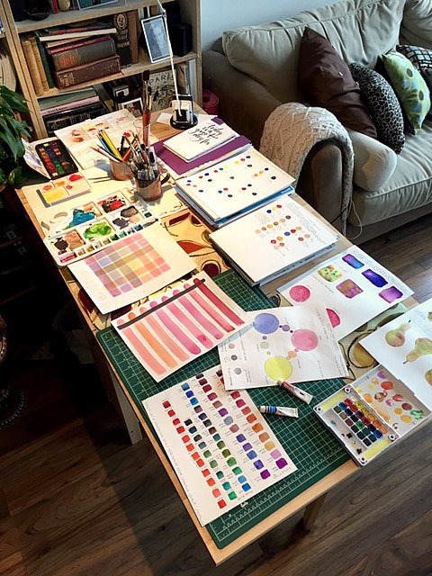
Now that my love affair with art is back on, my curiosity with colour mixing is insatiable. My art table is plastered with colour swatches. Running out of mixing wells, I’ve turned to dinner plates to accommodate all of my experiments. As the holidays approach, I’ll be finding a new spot for my tree because my art table isn’t going anywhere.
What I’m learning is that some colours really do have to be purchased because they are made from rare and expensive pigments sourced from nature. But things like black and flesh tones are better and more alive when you create them from scratch using the three primaries: red, yellow and blue. You just have to play with proportions. Use lots of ultramarine blue and you’ll get black. Use more red and yellow and you’ll get peach. To make it paler, don’t add white, add water.
The rows of tube paints that my parents furnished me with in the 1980s and nineties are long gone. Today, I’m learning what it means to work with the absolute basics. Finding out that there are infinite possibilities when you pare right down is heartening.
The lesson extends beyond painting.
November 2, 2016
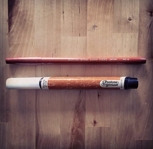
Remains from the ancient city of Hamilton: Pantone broad-nib marker carbon tested to 1981, and Buffalo Artist Marker, circa 1976 (note the teeth marks on cap, thought to be placed there by a small child).
These exceptional finds post-date the Minoans, Mycenaeans, Greeks and Romans. And while they may be grouped with other common finds — like metal work, lamps and pottery — they add immeasurably to the material remains of past cultures.
Badly preserved drawings of the period, thought to be executed with these tools, include highly crude representations of people, decorative flowers and sober two-dimensional structures with puffing chimneys.
October 29, 2016
“We work for society.” This is how my dad, Trevor Garwood-Jones (1928-2011), described an architect’s responsibilities to the communities they build in. Buildings house our existing emotions, but also create new ones — some drab, some inspired depending on the quality of the design.
Beauty was key, in Trevor’s mind, to building empathy and a sense of connectedness between human beings. He wasn’t one bit shy about admitting that he wept each time he stood inside an empty French Gothic cathedral. Beethoven had the same effect on his tear ducts. That’s one of the reasons why he specialized in acoustics.
During his career, Trevor found a resistance in the men he dealt with — builders, engineers, government officials, clients — to most aspects of beauty beyond the female form. Many outright refused to discuss colour with him, saying they would bring in the wives to deal with that. “They’re not at home in an artistic environment,” dad said. “It’s like they’re saying, ‘Colour is beneath us, or effeminate or we don’t want to deal with it.’ There’s a nervousness there, which means you can’t show them the direction you’re trying to go in. Devaluing the arts [like this],” he said, ” affects all society.”
This interview was shot in 1991 and stored on a DVD. I screened it on an ancient laptop that I’m glad I didn’t throw out.. I don’t know who organized and shot this video, but if someone does know, please email me so I can credit their work and thank them.
October 23, 2016
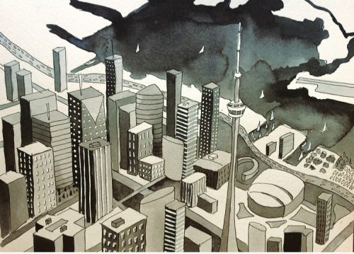
“His sheer tenacity and desire to learn made him pretty well a one-in-a-million bird.” — Jonathan Livingston Seagull soaring over The 6ix.
My tools: Google Earth, Parker Permanent Black Ink, Pentel Correction Pen, Micron 05 Pen, Nobel no. 2 Brush, Curry’s no. 8 Brush.
September 30, 2016
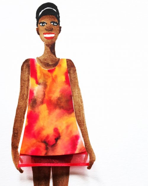
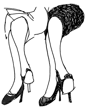
Yesterday’s Autumn leaves are today’s fashion.
Painted with four Tombow Brush Pens.