Accessible Design in Canada
August 30, 2016
FIFTY YEARS AGO, graphic design meant two things: working in print and kicking out mind-blowing creative. Wait, make that three: insisting on your own vision. The brash antics of Madison Avenue’s “Big Idea” branding campaigns, personified by George Lois and his “my way or the highway” client dynamic, have long since been replaced by a more cautious, self-conscious, albeit powerfully democratic push toward user-focused (UX) design, with its emphasis on utility, accessibility and user satisfaction. In Ontario, accessible (or inclusive) design is the law.
Accessible design has set itself a lofty mandate to leave no one behind, while serving the widest range of permanent and temporary accessibility issues imaginable—from visual, linguistic, auditory and motor to vestibular, cognitive and everything in between. Proponents like to joke that if you plan to live past the age of 45, then UX’s clear fonts, generous point sizes and proper colour contrasts are for you! Heck, if your optometrist has sent you into the subway system, eyes flooded with pupil-dilating drops, inclusive design is your friend, too. “Basically, we’re building the future for ourselves,” says Adam Antoszek-Rallo RGD, the founder and creative director at Catalyst Workshop, Inc.
At a time when Internet access is being upheld by the general public and the United Nations as a basic human right, Ontario is surpassing Madison Avenue, Silicon Valley and all of Europe in defining and developing how inclusive design should look, act and feel for print, web and the built environment. “I’ve done Google Trends searches on ‘web accessibility,’” says David Berman RGD, “and I’m amazed how Toronto and Ottawa come up as top cities on the planet.” Berman, who was the RGD’s first elected president, is currently a GDC Fellow and a roving consultant on the logistics of implementing accessible design in all contexts. He’s worked with the Canadian, Irish, Mexican and Omani governments, to name a few, and “Everyone is saying, ‘How do we replicate Ontario’s success?’”

Of course, not all designers are as gleeful as Berman by their province’s leadership and knack for good governance. Who hasn’t heard a colleague, drink in hand, moan at some industry event how accessibility is “the bane” of their existence? Meanwhile, having to explain to a client why a particular font or hue doesn’t pass the test is a common scenario. As Stüssy Tschudin, the RGD’s current president and principal of Forge Media + Design, sees it, “The province’s accessibility standards may limit our pure graphic approach, but they force us to think about how our work is going to function in the real world, and that’s an improvement on our design abilities.” Antoszek-Rallo agrees: “It’s an opportunity and body of knowledge that’s growing all the time.” Work, he says, can get boring after a while. “You end up repeating yourself. But this challenges us to make our creative better and resonant with more people and more consumers.”
The paradigm shift toward accessible design started with the passing of The Accessibility for Ontarians With Disabilities Act (AODA) in 2005. At the time, Queen’s Park gave government offices, businesses (with a minimum of 50 employees), non-profits and public sector organizations until 2025 to become fully accessible. It bears mentioning that these standards are non-existent in the rest of Canada. Manitoba has an act but no regulations yet, Nova Scotia is working on legislation, and BC is “a long way off,” says Berman. Still, there’s hope: the federal spring budget saw the government commit to restoring millions of dollars to greater accessibility and to creating a Canadians With Disabilities Act.

All along, the RGD has played a key role in figuring out how to explain accessibility, govern it and make sure it goes well. In 2010, in conjunction with the Accessibility Directorate of Ontario, the RGD published an easy-to-read handbook covering accessible design for print, web and environmental graphics (see sidebar, p. 34). This was followed by a second, web-only accessibility handbook that riffs on Web Content Accessibility (WCAG 2.0), the accepted international standard on web accessibility. “Accessibility is also a part of the certification process for all our members,” says Tschudin.
In the four years since fully accessible websites were mandated (any website built in or after 2012 must comply with WCAG 2.0 standards—see sidebar, above), a growing number of designers have found ways to push the rigid guidelines further than “do-good” design, to design that’s actually good. “You can’t treat WCAG 2.0 like it’s the Holy Grail,” Antoszek-Rallo explains. “It’s a man-made document written in 2006 before the first iPhone came out. We should be thinking beyond it.” Berman agrees: “If you follow everything, you lose your typographic tone of voice.” Both challenge designers to do better than Arial and Helvetica, the two most recommended typefaces. Experiment, says Antoszek-Rallo. “Find a style that works for the sighted and users with limited sight.” To get away with italics (a WCAG 2.0 no-no), he says, “You need to bold it and increase the amount of letter spacing.” This is not about ignoring compliance. “I just think there’s a difference be-tween the rules and the spirit of the rules.” When it comes to italics and typefaces, designers need to figure out where and when and how. “We should be thinking of the people who need it,” says Antoszek-Rallo, “but use our tools, like the No Coffee Chrome Extension (see sidebar, above), to test what actually works.”

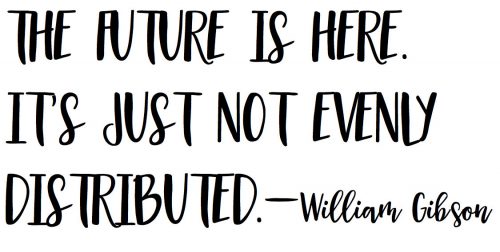
As for print, “[accessibility] is on the minimal side,” says Tschudin, and mostly about contrast, font choices, point sizes, hierarchy and non-glare printed surfaces, most of which were relevant before inclusive design thinking. “The main parts we’re interested in, and testing for, are web and environmental compliance.” And the blending of the two. Donna Saccutelli’s problem solving in information design, in collaboration with Seneca College’s Paul Schecter and Jutta Treviranus at OCAD’s entrepreneurial hub, Imagination Catalyst, show we are on the cusp of a redesigned landscape and retail environment where Universal Product Inclusive Codes (UPiC) printed on packaging are closing the loop between the physical world and the cloud. Provided their phone’s native accessibility settings are turned on, they get a readout of the product name, brand, ingredients and nutrition facts. Saccutelli even hopes to embed brand jingles into the app so the blind can hear Tony the Tiger’s “They’re great!” when they pick up and scan the Frosted Flakes box. “We’re creating a store that’s turned on,” she says. As William Gibson famously said, the future is here—it’s just not evenly distributed.
As William Gibson famously said, the future is here—it’s just not evenly distributed.
This article originally appeared in the August issue of Applied Arts Magazine.








Leave a Reply