


We eat with our eyes
July 5, 2017
For some gigs, I will make hyper-realist prep sketches to help establish the colours and boundaries for my final illustration. To wit:
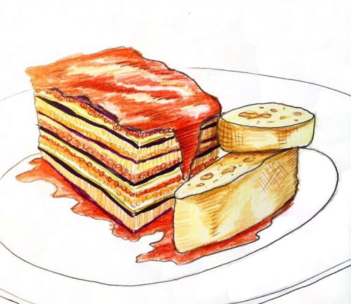
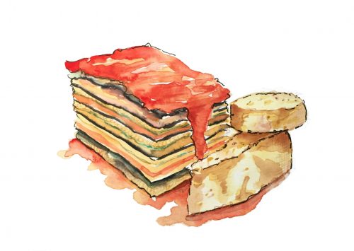
I prefer the suggestiveness of gestural sketches, but I think for this job — menu illustrations for The Merchant Tavern) — realism helps. We eat with our eyes. This is The Merchant’s popular Eggplant Stack (a lasagna, if you can’t tell). Here’s the second version in watercolour first, then lightly defined in parts with waterproof ink:
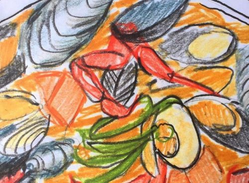
Then there’s the Seafood Pot (same deal: watercolour lighly outlined in parts with ink):
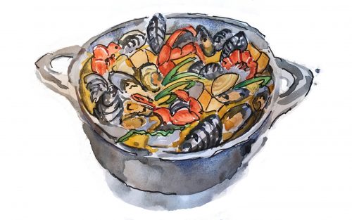
The challenge here was making all the items in the pot legible. Most of the problem solving happens in the prep sketch, usually done in watercolour pencil. Here you have to prove you know what you are doing. In the sketch you establish your colour scheme and the placement of the elements. The fewer the colours, the more harmonious the composition.
The watercolour sketch for the Merchant’s Traveller’s Salad was my idea of less is more. Even the buckling of the cheap paper I did this on worked in its favour. After all, lettuce ripples:
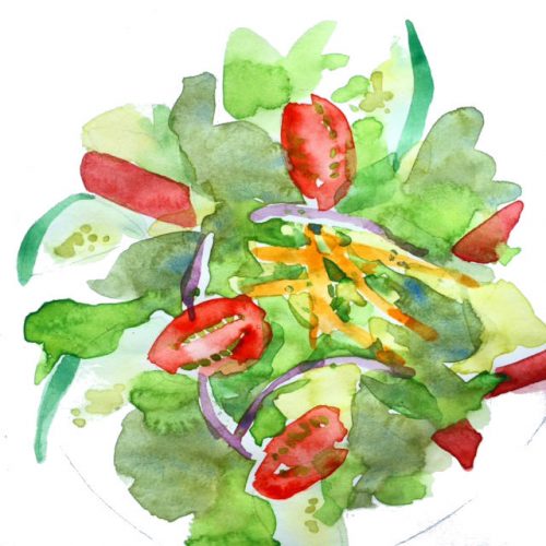
For the final, I inked the shapes so the salad would be legible for people reading the menu and trying to choose a starter. I prefer the sketch, but there you go:

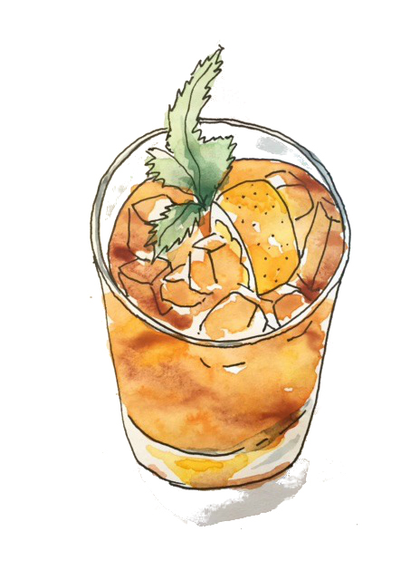
Studying process is fun, isn’t it? For these sketches, I just stared at the wine glass in front of me and went for it:
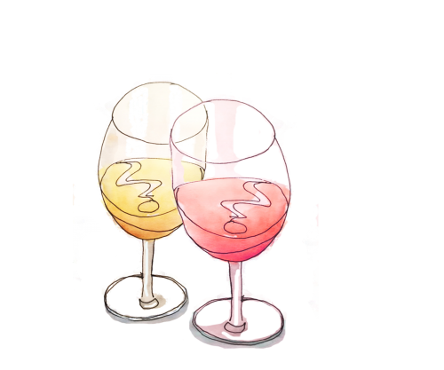
Bottoms up:
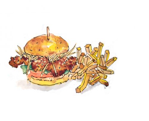
Let’s finish with a cripsy fish sandwich and a side of fries:


Leave a Reply