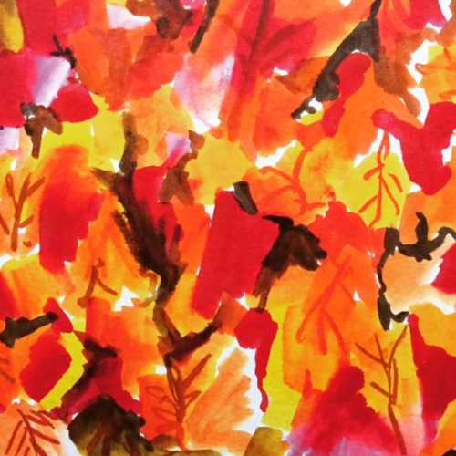
I drew this with 4 Tombow Brush Pens.


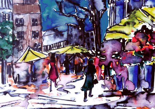
September 27, 2016
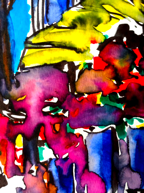
I obsess over colour.
I stare until I’m forced to blink.
Then I stare some more.
Do you see the atomic lift off in the yellow?
Pure magic.
September 27, 2016
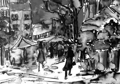
In black and white, it tells a different story:
“I have returned from Germany with peace for our time.” —
Neville Chamberlain, 1938, after securing a promise from Hitler.
September 27, 2016
The candidates said what they said and the vendors went back to selling flowers.
#life #hope #beauty #fate
I drew this with Tombow Brush Pens and a waterbrush.
September 26, 2016
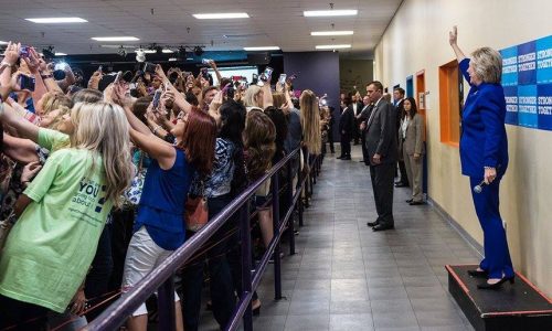 Photo Credit: Barbara Kinney/Hillary for America
“It’s not in my DNA to be self-promotional,” said the Gen X’er.
September 19, 2016
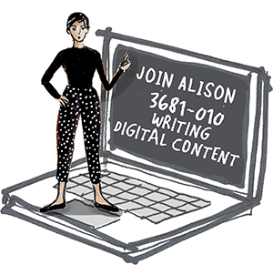
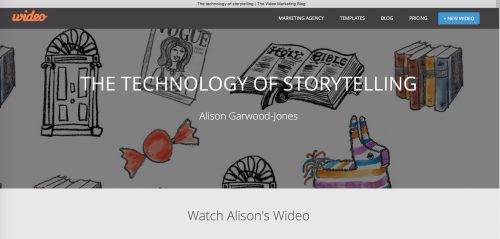
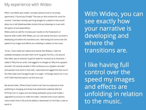
Observation is my primary occupation. It takes on many forms: writing, drawing, and now videos.
While most people have been video DIY’ers since 2005, when YouTube launched, I only took to the form when the story I wanted to tell needed video effects to lift it off the ground.
I prefer to be led by an idea, not seduced by the availability of simple technology.
Create something because you must, not because you can.
In the meantime, thank you to Wideo, an animated video creation platform based in Buenos Aires, for asking to feature my work on their blog.
September 7, 2016
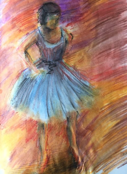
When you tire of your own form, the old masters and mistresses on your shelves offer up plenty of inspiring instruction.
Thanks, Monsieur Degas!
Watercolor pencils are responsible for this sketch and schmear effect.
August 30, 2016
FIFTY YEARS AGO, graphic design meant two things: working in print and kicking out mind-blowing creative. Wait, make that three: insisting on your own vision. The brash antics of Madison Avenue’s “Big Idea” branding campaigns, personified by George Lois and his “my way or the highway” client dynamic, have long since been replaced by a more cautious, self-conscious, albeit powerfully democratic push toward user-focused (UX) design, with its emphasis on utility, accessibility and user satisfaction. In Ontario, accessible (or inclusive) design is the law.
Accessible design has set itself a lofty mandate to leave no one behind, while serving the widest range of permanent and temporary accessibility issues imaginable—from visual, linguistic, auditory and motor to vestibular, cognitive and everything in between. Proponents like to joke that if you plan to live past the age of 45, then UX’s clear fonts, generous point sizes and proper colour contrasts are for you! Heck, if your optometrist has sent you into the subway system, eyes flooded with pupil-dilating drops, inclusive design is your friend, too. “Basically, we’re building the future for ourselves,” says Adam Antoszek-Rallo RGD, the founder and creative director at Catalyst Workshop, Inc.
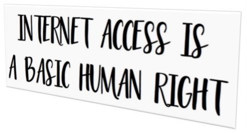
At a time when Internet access is being upheld by the general public and the United Nations as a basic human right, Ontario is surpassing Madison Avenue, Silicon Valley and all of Europe in defining and developing how inclusive design should look, act and feel for print, web and the built environment. “I’ve done Google Trends searches on ‘web accessibility,’” says David Berman RGD, “and I’m amazed how Toronto and Ottawa come up as top cities on the planet.” Berman, who was the RGD’s first elected president, is currently a GDC Fellow and a roving consultant on the logistics of implementing accessible design in all contexts. He’s worked with the Canadian, Irish, Mexican and Omani governments, to name a few, and “Everyone is saying, ‘How do we replicate Ontario’s success?’”
Of course, not all designers are as gleeful as Berman by their province’s leadership and knack for good governance. Who hasn’t heard a colleague, drink in hand, moan at some industry event how accessibility is “the bane” of their existence? Meanwhile, having to explain to a client why a particular font or hue doesn’t pass the test is a common scenario. As Stüssy Tschudin, the RGD’s current president and principal of Forge Media + Design, sees it, “The province’s accessibility standards may limit our pure graphic approach, but they force us to think about how our work is going to function in the real world, and that’s an improvement on our design abilities.” Antoszek-Rallo agrees: “It’s an opportunity and body of knowledge that’s growing all the time.” Work, he says, can get boring after a while. “You end up repeating yourself. But this challenges us to make our creative better and resonant with more people and more consumers.”
The paradigm shift toward accessible design started with the passing of The Accessibility for Ontarians With Disabilities Act (AODA) in 2005. At the time, Queen’s Park gave government offices, businesses (with a minimum of 50 employees), non-profits and public sector organizations until 2025 to become fully accessible. It bears mentioning that these standards are non-existent in the rest of Canada. Manitoba has an act but no regulations yet, Nova Scotia is working on legislation, and BC is “a long way off,” says Berman. Still, there’s hope: the federal spring budget saw the government commit to restoring millions of dollars to greater accessibility and to creating a Canadians With Disabilities Act.
All along, the RGD has played a key role in figuring out how to explain accessibility, govern it and make sure it goes well. In 2010, in conjunction with the Accessibility Directorate of Ontario, the RGD published an easy-to-read handbook covering accessible design for print, web and environmental graphics (see sidebar, p. 34). This was followed by a second, web-only accessibility handbook that riffs on Web Content Accessibility (WCAG 2.0), the accepted international standard on web accessibility. “Accessibility is also a part of the certification process for all our members,” says Tschudin.
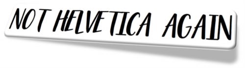
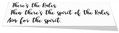
In the four years since fully accessible websites were mandated (any website built in or after 2012 must comply with WCAG 2.0 standards—see sidebar, above), a growing number of designers have found ways to push the rigid guidelines further than “do-good” design, to design that’s actually good. “You can’t treat WCAG 2.0 like it’s the Holy Grail,” Antoszek-Rallo explains. “It’s a man-made document written in 2006 before the first iPhone came out. We should be thinking beyond it.” Berman agrees: “If you follow everything, you lose your typographic tone of voice.” Both challenge designers to do better than Arial and Helvetica, the two most recommended typefaces. Experiment, says Antoszek-Rallo. “Find a style that works for the sighted and users with limited sight.” To get away with italics (a WCAG 2.0 no-no), he says, “You need to bold it and increase the amount of letter spacing.” This is not about ignoring compliance. “I just think there’s a difference be-tween the rules and the spirit of the rules.” When it comes to italics and typefaces, designers need to figure out where and when and how. “We should be thinking of the people who need it,” says Antoszek-Rallo, “but use our tools, like the No Coffee Chrome Extension (see sidebar, above), to test what actually works.”
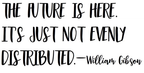
As for print, “[accessibility] is on the minimal side,” says Tschudin, and mostly about contrast, font choices, point sizes, hierarchy and non-glare printed surfaces, most of which were relevant before inclusive design thinking. “The main parts we’re interested in, and testing for, are web and environmental compliance.” And the blending of the two. Donna Saccutelli’s problem solving in information design, in collaboration with Seneca College’s Paul Schecter and Jutta Treviranus at OCAD’s entrepreneurial hub, Imagination Catalyst, show we are on the cusp of a redesigned landscape and retail environment where Universal Product Inclusive Codes (UPiC) printed on packaging are closing the loop between the physical world and the cloud. Provided their phone’s native accessibility settings are turned on, they get a readout of the product name, brand, ingredients and nutrition facts. Saccutelli even hopes to embed brand jingles into the app so the blind can hear Tony the Tiger’s “They’re great!” when they pick up and scan the Frosted Flakes box. “We’re creating a store that’s turned on,” she says. As William Gibson famously said, the future is here—it’s just not evenly distributed.
As William Gibson famously said, the future is here—it’s just not evenly distributed.
This article originally appeared in the August issue of Applied Arts Magazine.
August 22, 2016
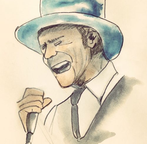 Gord Downie in his last concert by Alison Garwood-Jones
When I was a student at Queen’s University in the late 1980s and early nineties, my tape collection alternated between love anthems (Whitney Houston and Mariah Carey), girl bands with matte lips and cool hair cuts (Wilson Phillips) and duos with no hair cuts (Indigo Girls). Throw in some salsa from the Gipsy Kings and you pretty much have my music profile from that time.
Like every Queen’s student, I knew about The Tragically Hip and saw posters of their next show staple gunned to hydro poles around Kingston. My classmate Leslie even married their lead guitarist, Rob Baker. A week after their nuptials, she returned to our small seminar on British art with a quiet perma smile. Still, Gord’s voice (his singing voice) and overall weirdness didn’t cut through my AM Radio bent. Strangely, though, his lyrics “38 and never kissed a girl,” unknown to me then, did cross my mind one night 25 years ago when my friends and I were at a pub in Kingston and turned around to see David Milgaard sitting in a corner. Alone.
This is one of many examples of Downie’s ability to capture a feeling, a moment and a place, all the while tapping into the two central preoccupations of Canadian poetry and fiction: survival and victims. (h/t Margaret Atwood). And now that I’m truly delving into Gord’s lyrics and poetry (thanks to my friend Marie), I’m going specific and broad in my thinking. I’m seeing how the Hip fit squarely into The Triumph of Narrative journalist Robert Fulford described 15 years ago in his Massey Lecture on storytelling. Fulford described how human lives shape stories and stories shape human lives.
Last night’s nationally-broadcast concert shows us that as we grow further away from 1867, that lack of conviction we’ve consistently exhibited through the decades whenever we or someone else asks, “What does it mean to be Canadian?” is being progressively overwritten by this surprisingly intense and nuanced behaviour as complex and changeable as love itself. It’s nothing like America’s self-love — so sure, so entitled, so prone to devolving into the grotesque. The Rio Olympics showed us where that can take you with Ryan Lochte and the traitor backlash Ashton Eaton experienced when he donned a Canada hat to cheer on his Canadian wife, heptathlete, Brianne Theissen-Eaton.
If I can paraphrase Fulford, last night’s concert in parks and squares across the nation provided us with a glimpse of inner lives being lived around us. “The glimpse will always be brief and tantalizing, like landscape being revealed for an instant by lightning, but it suggests a wondrous richness, a splendid variety. It rebukes glib assumptions about the blandness of our fellow citizens.” And, if I may add, it builds on itself.
Thank you, Gord, for bringing us into our lives and our country.
August 18, 2016
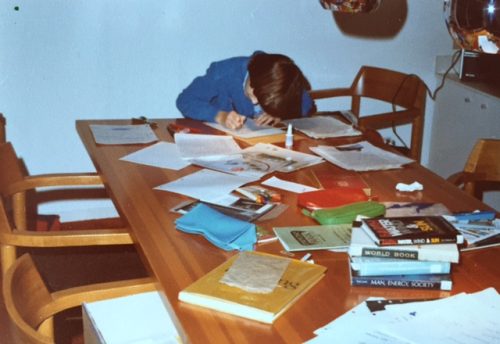
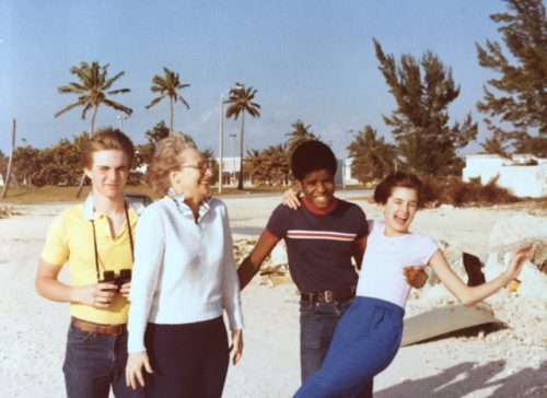
Cleaning up the remains of our parents’ days has been a long process for my brothers and me. Five years to be exact.
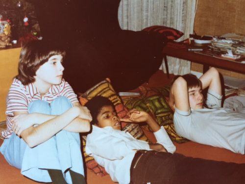 From left to right: Alison, Richard and Peter. We’re probably watching Wimbledon or the U.S. Open.
Yesterday, as I was studying the photographic evidence of our childhoods inside a non-descript industrial storage unit, I experienced a sense of peace and order I wasn’t expecting and haven’t truly felt since the days when orbiting the very alive Catherine and Trevor was the only way of being the three of us knew.
 There she is, the dynamic Catherine Garwood-Jones with her kids. Photo by Trevor.
And here I am today living in that future that the wee, then lanky girl in the photos was being groomed for. This was before she knew what form it would take. I’m sure my brothers are also flipping back and forth between past, present and future. I’ve read enough “Passages”-style pop psychology to know that we all think about this stuff.
Those books and magazine articles said that the moment would arrive when you realize that the bright future that was once so far ahead of you is officially more behind you. It’s like crossing the continental divide. I did that in a riverboat tour on the Danube with my dad six months before he died. The captain of the ship blew the horn and let us know when we had ceased our connection to the land and were now officially being drawn towards the open ocean.
I share this not to bring myself or the reader down. I’m writing it because it reinforces something in me that has been the only information I’ve ever had about the world. And now I know why.
Yesterday, during our organizing session, my brother placed in front of me a stack of notes in our mother’s handwriting.
At some point, forty plus years ago, she thought it important to organize her thoughts on the best way to raise secure, independent children. Some of it sounded like her voice, the rest read like a textbook or a medical journal. A quick Google search showed that she was pulling ideas from The Intelligent Parents’ Manual, by Dr. Florence Powdermaker and Louis Grimes. Can’t you just see them in their clinicians’ jackets? Such models of medicine and home economics! Having lived in London, England throughout the 1950s in a flat lined with beige and orange Penguin classics, I’m guessing that our mum had the 1956 Penguin edition (the cover art is charming).
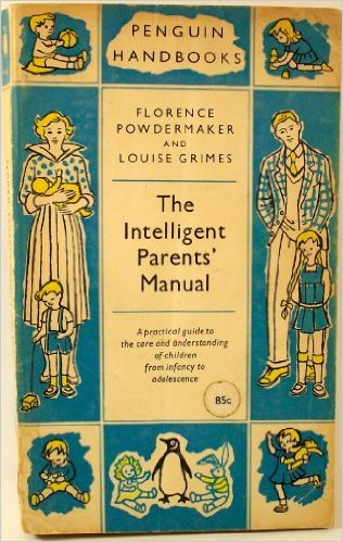 Powdermaker and Grimes’ book is now out of print. This is the 1956 Penguin edition.
But beyond the Penguin cool factor, what truly caught my breath was coming upon the phrase, “Alison and her drawings” inserted into a paragraph about art and storytelling. Finding a parent referring to you, years after they have died, gives you an unexpected new wave of love and encouragement from them you weren’t expecting on your average Tuesday.
“Allow experimenting and doing things in new and different ways,” wrote the authors, and so transcribed my mother. “Let them paint in their own way instead of always imitating others and sticking to the hidebound, conventional ways. Let them paint what they desire instead of copying some model that may mean little or nothing to him. “[Alison and her drawings]. In music, drawing and storytelling, the child’s own spontaneous and undirected expression should be encouraged.”
I suspect my mother’s own good instincts on how to encourage children (and people of all ages, for that matter) were there all along and only reinforced by this book. Hence the notes.
I was so glad my brother found this stash at a time when all three of us are looking towards the open ocean. I’m handling the waters by writing, drawing, canoeing, pulling my friends closer, eating more expensive cheese and artisanal olives, and searching for poems and biographies that describe the thick stew of emotions that form after you lose both parents. For whatever reason, fiction is leaving me cold. This stew has sometimes slowed me down to a crawl on par with folks much, much older than I am. My sluggishness and hazy contemplation are completely at odds with the frenzied, convulsing and not particularly welcoming workforce we’re all participating in right now. It’s not something you can really explain to others.
Being reminded by my mother in notes taken over forty years ago that I need to “experiment and do things in new and different ways, and portray what [you] desire,” compels me to get back to the unconventional path that has me steering myself somewhere between writing, drawing and teaching, all the while paying no mind to convention.
I was. She saw. Hence, I became.